Nothing can help tell a story like good data: It can lend credibility and impact to any argument or succinctly summarize an issue like practically nothing else can. Storytelling with data is a subtle art. Not only do you have to find just the right piece of information to make your point, but you have to present it in the correct way, based on the context of the situation.
A dense spreadsheet of figures probably isn’t the best way to make a point in your next big presentation, and a PowerPoint slide with just a few data points won’t be able to persuade some of your more data-minded partners.
So what does good storytelling with data look like? We’ll teach you how to do it with survey data in three simple steps, using the powerful, easy-to-use tools only available with SurveyMonkey.
Step 1: Find the best data points to tell your story
The best storytelling with data focuses on a concise narrative, without including extra information that can distract from the points you’re trying to make. That means you’ve got to go digging for just the right data, because often the best nuggets are hidden beneath the top-line results.
Luckily, you don’t need to be a data scientist to spot interesting trends in your survey results. You can use SurveyMonkey’s analysis tools, like filters and compare rules, to find everything you need without even touching a spreadsheet.
Use filters to look under the surface
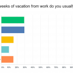
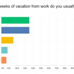
Filters are the simplest tools for finding trends under the surface of your survey data. Filters allow you to see how a particular group of respondents answered the questions in your survey, based on how they responded to other questions in your survey.
For example, say you asked a Net Promoter Score® question and wanted to see how promoters responded to other questions in your survey. You could set up a filter based on the NPS question and choose to view only results from people who scored a 9 or 10 (ie. promoters). This works with practically any type of survey question—even open-ended questions if you’re clever (we’ll get into that later).
Use compare rules to see how groups differ
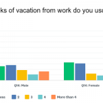
Instead of focusing on how a single group of respondents answered your survey, compare rules allow you to view the responses from two groups side-by-side. This makes compare rules the easiest way to see how one group’s responses to your survey are similar—or different—from another group’s.
Let’s say you’re running an employee engagement survey and you want to show the differences in how managers and individual contributors responded. By applying a compare rule to the question that asks about job roles, you can compare, side-by-side, how they responded to every other question in your survey.
Use combined filters to look even closer
While filters and compare rules can do a lot to unearth interesting stories and patterns in your data, sometimes you have to look even deeper into your results to get the perfect data point to tell your story. Combined filters allow you to do this by using multiple filters together, with AND, OR, and NOT logic.
There’s an entire post on how to use combined filters, but there’s practically no limit to how closely you can hone your results with them. You can look at the responses from only people who are managers AND have low engagement, everyone with a high NPS score OR a favorable impression of your brand, or anyone who’s a manager but is NOT based in your home office.
Create a custom crosstab report
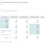
Crosstabs Reports are basically tables that show a breakdown of how different groups of respondents in your survey (typically the columns of the table) answer different questions in your survey (typically the rows of the table). Like filters, they’re useful for looking under the surface of your top-line results and seeing how different people answer questions in your survey differently.
For example, say you ran a brand awareness survey and you wanted to see how each of the different demographic groups you sent the survey to, responded differently. A crosstab report would be the perfect tool to see the breakdown of all their responses together and to spot any interesting differences.
Turn your results into action
Learn about all the tools available in SurveyMonkey that help you collect, share, and act on your survey data.
Step 2: Turn open-ended responses into persuasive proof points
Nothing tells a story like words straight from your respondents. While open-ended questions allow respondents to answer in their own words and offer perspectives you hadn’t thought of, they can be a bit unwieldy to deal with.
If you’re running a large-scale survey, you could find yourself going through hundreds—or even thousands—of survey results to find the right quote to tell your story.
Fortunately, we’ve got a few tools that make it easier to sort through your open-ended responses and use them to tell the story you want.
Make a visually appealing summary with a word cloud
The simplest way to summarize the responses to your open-ended survey questions is to use a word cloud generator. Word clouds are simple visualizations that show the words that are used most often in responses to your open-ended questions. The bigger the word appears, the more common it is.
Word clouds are useful for summarizing your results in broad strokes or getting across the general themes in your results. If a word catches your interest, you can click on it to see all the relevant responses—a good way to zero in on different subgroups.
Hearing the voices and opinions of your customers, employees, or prospects in their own words can be extremely persuasive. While word clouds generators are handy and easy to use, having a few quotes from respondents add a relatable, human touch to the story you tell with your survey results.

Tag, organize, and filter your open-ended responses
Ultimately, you’re going to want to go through your open-ended responses to find the best quotes to tell your story. Tagging the responses makes it much easier to categorize and organize these responses so they don’t get lost in the wash.
For instance, you could tag all responses you consider constructive or valuable so that they’re easy to find in the future. Or, if your customers left feedback on different aspects of their experience with your company, you could categorize their responses so that they’re conveniently organized and color coded by those aspects.
Finally, once responses have been tagged, you can use filters on the tags to see how those respondents answered other questions in your survey.
Sorting through open-ended responses may be a manual process, but you can make things much easier on yourself with tagging.
Use AI to capture respondents’ sentiments
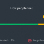
Every response to your open-ended questions has a sentiment behind it—some are positive, some are negative, and some are neutral. By using a machine learning algorithm to spot words that correlate to particular sentiments, SurveyMonkey can automatically categorize text responses as positive, negative, or neutral.
Similarly to word cloud, sentiment analysis allows you to easily show the breakdown of how people feel about the issue your open-ended question addresses. You can use this to generally understand or show off how people answer the question without having to manually inspect each individual response.
Step 3: Choose the best way to share your story
Once you’ve collected all the most pertinent data points using survey analysis tools, it’s time to start telling your story. As we mentioned before, the context is just as important as the method you choose to share your survey results. Let’s take a look at some of the most popular methods for data storytelling with survey results and when the best time to use them is.
Create a Results Dashboard from your survey data
Results Dashboards let you take the most important charts from your survey results, customize them to look exactly how you want, and contextualize them with text that explains what the charts really mean.
Results Dashboards are the most versatile option you have for storytelling: they’re visually appealing enough to share in a presentation, and the extra context from the custom text you can add to them means you can share them in a message or email and trust that everyone will still understand the key takeaways.
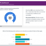
with relevant custom text.
Export your results to a presentation-ready format
Adding survey data to your presentations is a great way to make them more impactful and interesting. In SurveyMonkey you can easily export your results—or individual charts—in presentation-ready formats like PowerPoint.
Before you export your charts, it’s a good idea to clean up your charts to make sure that they’re in the right format, that all the text is showing correctly, and you’re actually displaying the data you want to display. Don’t forget your open-ended responses! Word clouds and Sentiment Analysis charts make great additions to presentations.
Share digestible Crosstab Reports of your raw data
Some people prefer to digest data by looking at the raw numbers, but if you simply give someone a readout of all your results, they might miss the points you’re trying to make or draw other conclusions entirely. Crosstab Reports let you have the best of both worlds: You can give people data in a raw format (in a table that’s also easy to read or scan), while making sure they’re seeing the information you want them to see.
Send a link to your raw results
Sharing a direct link to your survey results is the simplest method for sharing results, but it also leaves you with the fewest options for storytelling with your data. You can customize your graphs, and create saved views of your data with filters and compare rules applied, but you’re still leaving it up to your readers to draw their own conclusions.
Depending on your audience, this type of freedom might be a good thing. If you want to give teammates full access to your results and let them slice and dice the data themselves using SurveyMonkey’s filter and compare tools, this is the perfect option.
Even with advanced analysis and reporting tools, storytelling with data can be more art than science. You’ve got to develop a sense for where the most useful data will be, and a knack for how to present it so that it has the greatest impact. Just like anything else, this takes practice.
If you start by following the recommendations in this article, you’ll have the fundamentals for what it takes to become a real pro. In time, you’ll develop your own tricks for sifting through data and a signature flair for how you present it. Happy surveying!
Turn your results into action
Learn about all the tools available in SurveyMonkey that help you collect, share, and act on your survey data.


