How to analyse survey data in Excel
Enhance your skills and make data-driven decisions using practical techniques to analyse survey data in Excel effectively.

Are you sitting on a goldmine of survey responses but unsure how to gain meaningful insights? If so, Excel is an accessible yet powerful tool that can help.
Key steps to analyse survey data in Excel
This guide will show you how to analyse survey data within Excel using its native capabilities, without the need for any add-ins or third-party tools.
In this guide, we’ll show you how to:
- Import and prepare data: Import your survey data from CSV files or a direct export, and then clean and organise it for analysis.
- Perform basic statistics: Use built-in Excel functions such as AVERAGE(), MEDIAN() and COUNTIF() to calculate customer experience (CX) metrics.
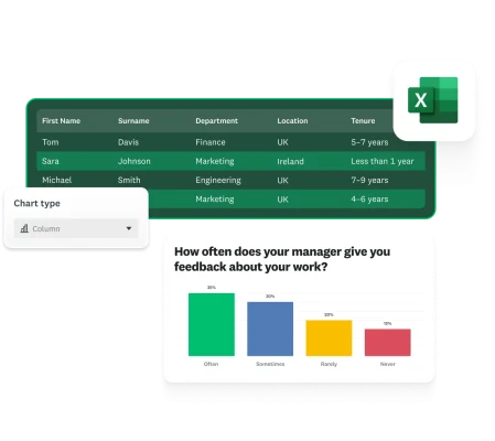
- Create visualisations: Transform your data into charts and graphs to identify patterns and trends.
- Conduct advanced analysis: Use pivot tables, crosstabulations and statistical tests to discover deeper insights.
- Apply best practices: Avoid common analysis mistakes and use time-saving techniques.
What is survey data analysis?
Survey data analysis examines collected feedback to identify patterns, draw conclusions and use the data to drive decisions.
Different types of survey data require different approaches to analysis. Quantitative data (numbers, ratings and scales) can be analysed using statistical methods, whereas qualitative data (open-ended responses, and comments) requires thematic analysis and categorisation.
Standard survey metrics that businesses typically track include:
- Customer satisfaction (CSAT) scores: A measurement of how satisfied customers are with a specific product, service or interaction, typically rated on a scale of 1–5 or 1–10.
- Net Promoter Score® (NPS®): A loyalty metric that measures the likelihood of customers recommending your product or service to others, calculated by subtracting the percentage of detractors from the percentage of promoters.
- Customer effort score (CES): A measurement of how much effort customers need to expend to interact with your company, use your product or resolve an issue, with lower customer effort scores indicating a better CX.
Related: How to analyse survey data
Step 1: Import and prepare your survey data
Getting survey data into Excel
- CSV import: Most survey tools allow you to export data as CSV files. Simply go to File > Open in Excel and select your file.
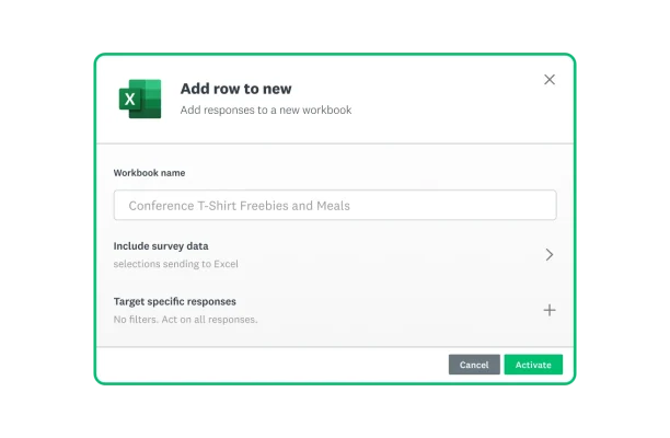
- Direct export: With SurveyMonkey, you can export survey responses to Excel using Connect – the native business app hub – to automatically add new responses to a spreadsheet.
- Direct input: For smaller surveys, you can create column headers and enter responses directly.

For example, to export data from SurveyMonkey to import into Excel:
- Log in and navigate to your survey.
- Click Analyse results > Save as > Excel (.xlsx).
- Open the file in Excel.
Note: There are additional export options, such as:
- Data view (current or original)
- Columns (condensed or expanded)
- Cells (actual answer text or numerical)
When exporting survey data, the analysis requires numerical cells instead of the actual answer text.
Expedite your survey analysis with Connect
Transfer your survey data to Excel using Connect; no data science credentials required.
Cleaning and organising your data
Raw survey data seldom comes in a perfectly analysable format, so follow these steps to prepare your data:
- Remove duplicates: Use Data > Remove Duplicates for clean results.
- Handle missing values: Either delete incomplete responses or replace them with consistent values.
- Create calculated fields: Add columns for derived values that you’ll need (e.g. age groups based on year of birth).
One thing you should know before exporting your data
Even ratings/scales come in text (e.g. strongly agree, somewhat agree, etc.). You must select ‘numerical value (1-n)’ for responses to have a number instead of text before exporting data. All of this article’s calculations depend entirely on responses being exported as numerical values instead of text.
Step 2: Basic statistical analysis of survey data
Calculating descriptive statistics
Excel offers several functions for basic statistical analysis that work perfectly with survey data. Here’s how to use them:
For numerical survey responses (such as ratings or scales), you can calculate the following:
Measures of central tendency:
- Average (mean): =AVERAGE(C2:C100)
- Median: =MEDIAN(C2:C100)
- Mode: =MODE.SNGL(C2:C100)
Response counting:
- Count responses: =COUNT(C2:C100) or =COUNTA(C2:C100)
For example, if you had customer satisfaction ratings in column C, you could quickly calculate the average satisfaction score with =AVERAGE(C2:C100).
Working with different question types
Different question formats require different analysis approaches:
Single-choice questions: When analysing questions where respondents select one option, you’ll need to count the frequency of each response. To do this, use COUNTIF and calculate the percentages.
Multiple choice questions: For “select all that apply” questions, each option typically appears in its own column (E, F, G, etc.) with a 1 if selected or 0 if not. To analyse:
- Count the total selections for the option in column E: Use =SUM(E2:E100).
- Find the percentage who selected this option: Use =SUM(E2:E100)/COUNTA(A2:A100) (where column A contains respondent IDs). Note: We use respondent IDs as the denominator because they represent the total number of responses.
Likert scale questions: For questions with rating scales (e.g. 1–5), you can:
- Calculate the average rating: Use =AVERAGE(F2:F100).
- Count the number of ‘5’ ratings: Use =COUNTIF(F2:F100,5).
- Calculate the Top 2 Box score (percentage of 4 and 5 ratings): Use =(COUNTIF(F2:F100,4)+COUNTIF(F2:F100,5))/COUNTA(F2:F100).
Text responses: For open-text responses, Excel offers several approaches:
- Count word frequency by first using ‘Text to Columns’ to separate words.
- Create a coding column where you manually categorise responses, and then use COUNTIF() to analyse those categories. Note: To measure the frequency of certain words, they will need to be exact matches (identical spelling).
When you apply these functions to your survey data, you can quickly generate statistical summaries that reveal trends and insights.
Step 3: Visualising survey data in Excel
Creating basic charts for survey data
Visual representations make survey data easier to understand:
- Bar charts: Compare responses across different categories.
- Pie charts: Show the proportional distribution of responses.
- Line charts: Track metrics over time.
To create any chart:
- Select your data
- Go to Insert > Charts
- Select the chart type
Visualisation techniques
Create heat maps using conditional formatting. Always include clear labels and sample sizes, and keep visualisations focused on key insights.
Step 4: Advanced analysis techniques
Crosstabulation analysis with pivot tables
Pivot tables are powerful tools for crosstabulation analysis, allowing you to explore relationships between different variables or compare metrics across segments. To create a pivot table:
- Select your entire dataset
- Go to insert > Pivot Table
- Add demographics to Rows
- Add metrics to Values
- Add another variable to Columns
Use filters and slicers for interactive analysis:
- PivotTable Tools > Analyse > Insert Slicer
- Connect slicers to multiple pivot tables
Correlation and statistical testing
Correlation analysis: Excel’s CORREL function reveals relationships between variables. Results range from -1 to 1. The formula is =CORREL(ARRAY1, ARRAY2), where ARRAY 1 is responses from one question and ARRAY 2 is responses from another question:
- Near 1: Strong positive relationship
- Near -1: Strong negative relationship
- Near 0: No relationship
1 = a perfect linear relationship, where a unit increase in ARRAY 1 leads to an equal unit increase in ARRAY 2.
T-tests compare means between groups. Use Excel’s TTEST function to determine whether the differences between groups are statistically significant using the Student’s T-Test technique. For example, you might compare satisfaction scores between male and female respondents. The function needs two ranges of data (one for each group) and parameters for test type and data type.
The chi-square test for independence examines whether or not two categorical variables are independent (i.e. statistically significantly different from each other). This test produces a p-value (probability value) that indicates whether the relationship is statistically significant. A p-value below 0.05, based on a confidence level of 95%, suggests that those two categories are independent and that the difference is not due to chance. Excel offers a built-in chi-square test for users.
Creating a data analysis plan
Start with a structured data analysis plan:
- Define key questions: Which specific business questions are you trying to answer?
- Identify metrics: Which metrics will help you to answer these questions?
- Plan comparisons: Which segments do you want to compare?
- Establish benchmarks: Which standards will you measure your data against?
- Determine timeframes: Will you track changes over time?
You should ensure that you document your approach to ensure consistency.
Tips for effective survey data analysis
Avoiding common survey analysis mistakes
Look out for bias:
- Non-response bias
- Social desirability bias
- Sample size limitations
Interpretation cautions:
- Correlation isn't the same thing as causation.
- Statistical significance doesn’t always equal practical importance.
- Outliers may skew small-sample results.
Consider multiple angles:
- Break down your results according to key demographics.
- Look out for any unexpected patterns or anomalies.
- Consider contextual factors that might explain your results.
Automation and time-saving techniques
- Create templates for recurring surveys.
- Use formulas to automate calculations.
- Build dynamic dashboards that update automatically with new data.
Integrating with other data sources
Enhance your survey analysis by combining it with:
- Customer data from your CRM system
- Website analytics
- Purchase history
- Support ticket data
Take advantage of SurveyMonkey integrations to connect your survey data to tools such as:
- Salesforce
- Microsoft Power BI
- Tableau
- Google Sheets
This integration creates a more complete picture of your customer experience and business performance.
Frequently asked questions
- How do I convert survey results to Excel?
- What’s the best way to analyse Likert scale data in Excel?
- How can I analyse open-ended survey responses in Excel?
- Which Excel functions are most useful for survey data?
- How do I create a dashboard for survey results in Excel?
Analyse your survey data more effectively with SurveyMonkey
Although Excel is a powerful tool for survey analysis, SurveyMonkey offers built-in analytics that make the process even easier:
- Automatic calculation of key metrics
- Ready-made charts and visualisations
- AI-powered insights that highlight key findings
- Custom filtering and comparison tools
- Real-time results as responses come in
Try SurveyMonkey today to collect, analyse and act on feedback more efficiently than ever before. Find out more.
NPS, Net Promoter and Net Promoter Score are registered trademarks of Satmetrix Systems, Inc., Bain & Company and Fred Reichheld.
Discover more resources

Solutions for your role
SurveyMonkey can help you do your job better. Discover how to make a bigger impact with winning strategies, products, experiences and more.

Continuing healthcare checklist: what UK healthcare providers need
Learn what information healthcare and social workers need to provide for a continuing healthcare checklist, what happens next and possible outcomes.

Turning employee engagement statistics into actionable surveys
Discover how to use UK employee engagement statistics to design effective surveys. Use actionable insights to boost retention and drive productivity.

Shaping the future: how British values in the workplace drive inclusion and engagement
Discover how ‘British values in the workplace’ surveys can reveal what matters most to employees, fostering inclusion and engagement.