Results Dashboard
Easily create and share dynamic survey dashboards with real-time results.

Show the story in your data
Transform your survey results into a report that your stakeholders will understand. With survey dashboards, you can highlight key takeaways and even add your own notes or recommended next steps. You can create multiple dashboards for any single survey. Plus, your dashboards stay up to date dynamically and can be shared with anyone via a weblink.
Zoom in on key insights
By creating survey dashboards, you can easily surface the most important details for specific groups. Help your stakeholders to see where and how to act on your survey results.
Customise your dashboard
Whether it’s for your boss, colleagues or clients, easily personalise how you share results. Filter answer data, select which questions to show, drag and drop charts and customise your layout.
Save everyone time
Show your stakeholders only the information that they want or need to see. Data will refresh dynamically as new results come in, so you won’t need to spend time updating static reports and presentations.

Take action on key metrics
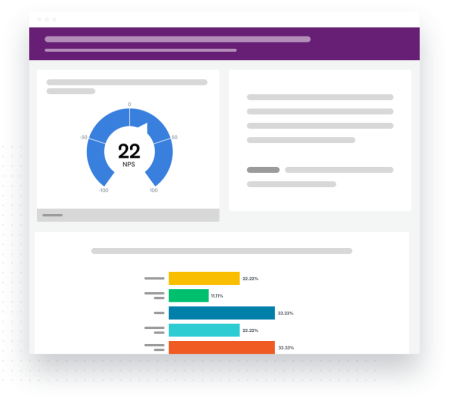
Want to monitor your Net Promoter Score®, identify its key drivers and easily keep everyone informed along the way?
With results dashboards, you can:
- Filter data by month or week and then show charts side-by-side to easily compare scores over time
- Add comments below or next to individual charts to flag changes or provide more context
- Display what delights your customers and what drives their dissatisfaction
- Customise charts and colours to personalise your dashboards
- Share your recommendations – all backed up by data – with executives, managers or even your own team
Ready to make your own dashboard?
Give people the data they need
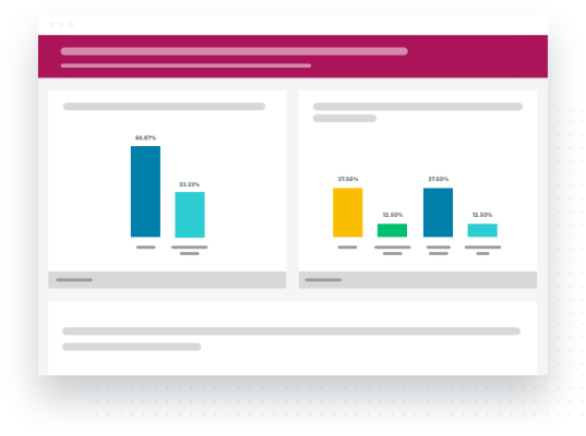
Only want to share some key findings with specific groups? Here’s how you could run a quarterly employee engagement survey across an organisation and give each team actionable insights.
With results dashboards, you can:
- Filter data by department, team or business unit, and create individual dashboards for any group
- Show stakeholders key points by including data about factors such as key attributes e.g. job satisfaction
- Tailor the look and feel of your dashboards with custom colours
- Show how teams or departments compare to overall averages
- Do a side-by-side comparison of results from different time periods to see trends and changes

Ready to build your own dashboards?
Discover more resources

Solutions for your role
SurveyMonkey can help you do your job better. Discover how to make a bigger impact with winning strategies, products, experiences and more.

How to Analyse Survey Data in Excel
Learn how to analyse survey data in Excel and gain insights with our easy-to-follow guide.

Continuing healthcare checklist: what UK healthcare providers need
Learn what information healthcare and social workers need to provide for a continuing healthcare checklist, what happens next and possible outcomes.

Turning employee engagement statistics into actionable surveys
Discover how to use UK employee engagement statistics to design effective surveys. Use actionable insights to boost retention and drive productivity.

