Survey text analysis made easy: Turn responses into actionable insights
Our text analysis tools help you quickly see the wood from the trees and go from qualitative data to insights without the need for tedious manual work.
See the bigger picture in qualitative feedback
Stop drowning in feedback left in open-ended text and comment boxes. Thematic analysis uses AI to automatically categorise your qualitative responses into meaningful themes, providing a clear understanding of what people are saying without hours of manual work.
- Identify and categorise key themes within your open-ended responses in seconds.
- Save the time you would normally spend manually organising data into meaningful categories.
- See how individual text responses align with key themes and easily export this data for further analysis.

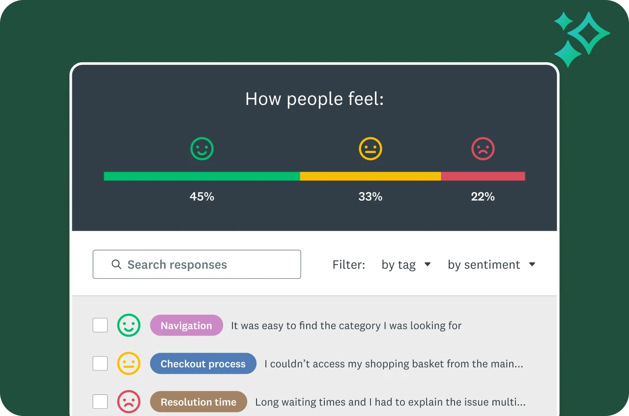
Understand sentiment at scale
Assess how respondents feel, not just what they say. Sentiment Analysis classifies open-text responses as positive, negative or neutral, helping you to read the mood across thousands of comments with ease.
- Save time as you see sentiments at a glance.
- Filter by sentiment to identify specific areas that need attention and act quickly.
- Filter a question by sentiment for even deeper insights.
Visualise text responses easily
Create word clouds for a quick visual interpretation of open-ended responses, highlighting the most frequently used words.
With customisable word clouds, you can:
- Choose colours or fonts to highlight specific words.
- Adjust the threshold for when words should appear.
- Hide words that aren’t relevant.
- Combine related words into a single category.


Tag for even more customisation
Looking for something very specific in your response data? If so, tag your responses to uncover even more specific information in your open-ended response data.
- Assign multiple, custom tags per response.
- Filter by tag to get focused insights.
- With an Enterprise plan, tags can be applied automatically as responses come in.
Note: Access to some text analysis features depend on your subscription plan.
Plans that suit you or your team
Basic
For anyone just getting started. Create unlimited surveys and collect 25 free responses in each survey.
Individuals
For individual users who need advanced tools and want to save with a flexible, feature-rich plan.
Teams
For growing teams who need great survey tools, branding controls and real-time collaboration features.
Enterprise
For organisations that need secure access, admin tools and powerful integrations at scale.
Discover more resources

Learn more about AI analysis features
Ask questions about your survey responses and identify key themes and sentiment using SurveyMonkey AI.

Analyse surveys like a pro
Learn best practices and see FAQs about data analysis on the SurveyMonkey platform.
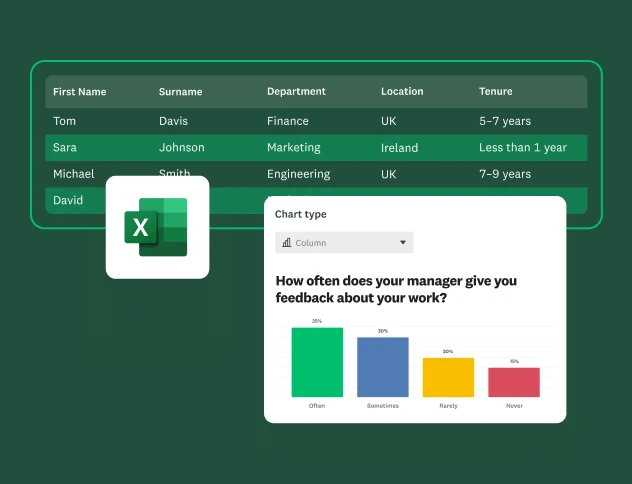
How to analyse survey data in Excel
Learn how to analyse survey data in Excel and gain insights with our easy-to-follow guide.

Discover our top features
Explore SurveyMonkey features that help you get insights fast.