We spend a great deal of time at SurveyMonkey focusing on survey design factors like crafting questions and answers well, implementing survey logic to get the most relevant data and ensuring that responses are not biased.
However, there is another critical component to good survey design: how you actually make the survey look and feel for your respondents. The better the visual design of your survey, the more likely respondents are to not only complete it, but also take your next survey. Our research has even found that younger respondents view modern, streamlined survey designs as more trustworthy.
So how can you create a survey that captures your audience’s attention, and keeps it? While you may be tempted to make your survey colourful or your typeface large and bold to stand out, you’ll be better off if you consider the following best practices:
1. Context is critical
Is your survey requesting feedback about professional services? Or is it asking people private or sensitive information? Overly playful colours will seem out of place and may raise issues of trust; consider using neutral colours (think of these brands’ colour palettes: Kaiser Permanente, IBM, Goldman Sachs).
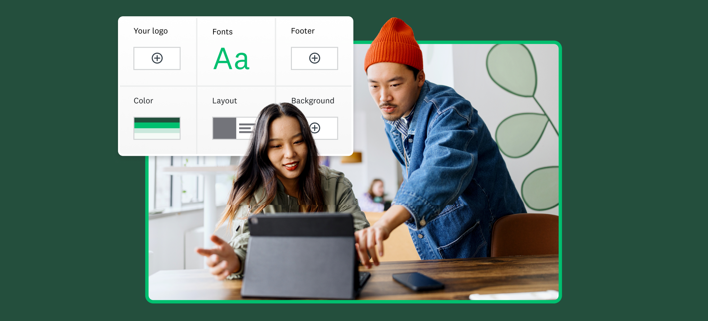
Is representing your corporate brand important? Include your company logo in the survey title and use your brand colour palette. Now if you’re sending a funny opinion poll to your friends about an upcoming party, then a plain survey might prompt them to make other plans, so feel free to let loose.
2. Make your content easy to read
Good design is about allowing the content to take the front seat. Most people skim when reading online so it’s important to make your text as easy as possible to read. To maximise legibility of your questions, consider increasing the text size of your questions and answer options.
Typically, sans-serif fonts like Arial, Helvetica and Verdana work best for the web based surveys. If your survey contains long passages of text, consider using a serif font such as Georgia or Garamond which are both appealing and easy to read. And while you may be tempted to choose a colourful background colour for your survey, remember that it will reduce the colour contrast and visually compete with the text, making reading a challenge. Try to make sure the colour of your text contrasts with the page background: black or dark grey text on white background might look a little plain, but it offers the highest colour contrast.
3. Give sign posts and progress markers
We’ve seen that keeping your total survey length as short as possible is a good way to design a survey that increases response rates. However, in cases where you are designing a longer survey, it’s good to manage your respondents’ expectations.
- In your survey introduction, tell them up front about how long the survey should take.
- Break up your survey into pages that don’t require a lot of scrolling so it doesn’t feel overwhelming.
- Use a progress bar so respondents can see how they are doing. People like to see progress!
Next time your colleague or manager asks you to make the survey “pop” a little more, refer them to this blog post for a little inspiration.